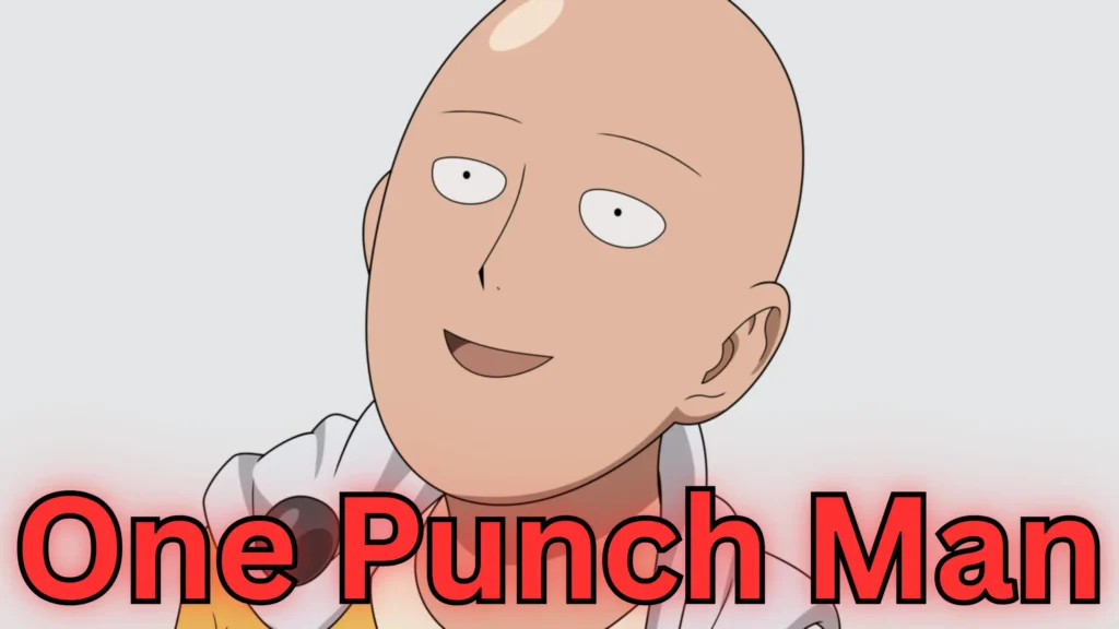
When a series as visually bold as One‑Punch Man returns after a long hiatus, expectations are sky-high. But while the new season arrives with fanfare, the animation department seems to be punching above its weight—yet missing many blows. In this piece I’ll explore where Season 3’s visuals shine, where they stumble, and what that means for the show’s legacy.
1. Legacy vs Reality
Season 1 of One-Punch Man set a gold standard for slick action visuals. Wikipedia and Ranker
Fast-forward to Season 3 and fans are already pointing out stiff frames and minimal movement.
One reviewer notes how the premiere “lacked the dynamic action sequences” that used to define the show. Gazettely
The contrast between what fans dreamed of and what they got creates a raw disconnect.
2. “Slideshow Animation” Syndrome
A core criticism: the series often resorts to still panels with minor motion instead of full-on fight choreography. For example:
“The characters’ animations were just rigid, like still frames with just lip animation slapped on.” Reddit
And:
“It almost feel like PowerPoint slides at some point.” Reddit
When an action series uses stillness instead of motion, the weight and impact of punches, confrontations and heroics get murky.
3. Production Strain Underpins the Visual Tumble
There are reports of scheduling, budgeting and staffing issues behind the scenes. According to one article, the teaser trailer for Season 3 was “created by a single animator,” sparking concern. Ranker and SoapCentral
Another discusses how animator pressure, tight deadlines and structural constraints hamper fluidity. ComicBook.com and ofzenandcomputing
The visible result: inconsistent quality and a visual experience that fails to match the tone.
4. The Studio Shift & Its Aftershocks
The change from studio Madhouse (Season 1) to J.C. Staff (Seasons 2 & 3) has been a recurring talking point among fans. The latter has proven itself capable, but many feel it’s not elevating the series in the way fans hoped. OtakuKart and gamesgreed.com
When you follow a season known for its kinetic visuals, subsequent entries naturally face severe comparison.
5. Hope Remains — If You Wait
Despite the critiques, there are signs of hope. Some outlets say design, lighting and color have improved relative to Season 2. GamesRadar and ofzenandcomputing
There’s also the possibility that key episodes will benefit from more budget or give-and-take time, potentially restoring some of the show’s visual punch. One article noted:
“The real test will be the next episode.” gamescreed.com
So while the early visuals raise red flags, the story is far from over.
Conclusion
The third season of One-Punch Man finds itself between two poles: the radiant visual legacy of Season 1 and the justified frustration of an eager fandom.
What should’ve been a triumphant return has instead exposed the pressures of production, studio change and hyper-expectation.
Yet, even beneath the shaky visuals and static frames, there remains a core of good storytelling and design effort.
If the show can channel its budget, time, and ambition into the right episodes, it still might land that knockout blow fans are waiting for.
Do you believe the animation quality of Season 3 will bounce back — or is the damage already done?
Sales Pitch
Want to buy the lasted volume of one punch man or have an up to date collection of the serious which animation is being sadly torn apart, then look no further for I have curated all the volumes in one place so that you don’t have to go looking, with a 7% discount, to save you some extra pennies. All you have to do is click “here“
Feel free to also browse my site to seen if anything takes your fancy “AnimeMerch4You“


